Stop rebuilding your pipeline report every month.

See progress across stages, capacity, and workload for every PV, BESS, and hybrid project the moment you ask. Dashboards turn the data your team already updates into live charts and views the whole team reads at a glance.

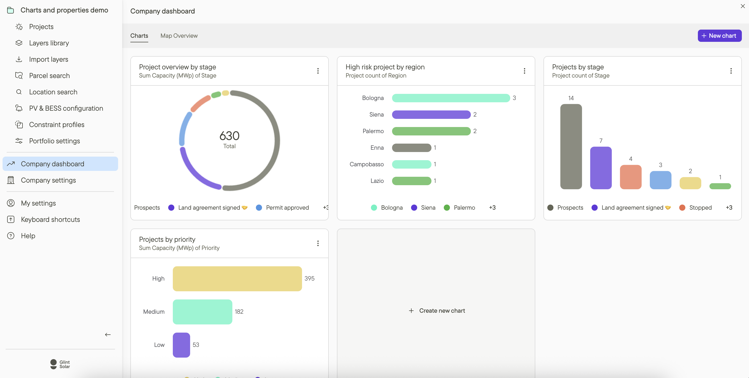
See the whole pipeline at a glance.

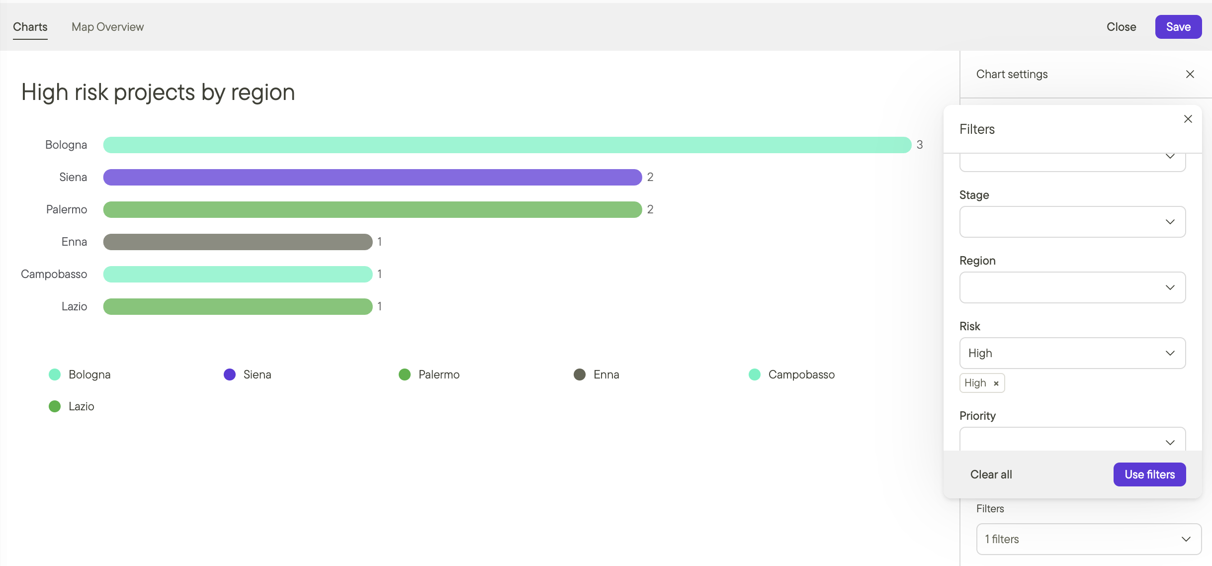
  • Bar, donut, and capacity charts show how projects spread across stages, regions, and technology, built from the data your team updates as they work.

  • Toggle any view between project count and capacity to see where the megawatts sit across your PV, BESS, and hybrid portfolio.

  • Open the Company Dashboard and the full pipeline is visualised instantly, with no export and no rebuild.

Company Dashboard in Glint Solar showing pipeline charts by stage, region, and priority

Spot bottlenecks before they cost you months.

  • Stack filters on stage, region, owner, and your own custom properties to isolate exactly what you need, like high-risk projects in permitting.

  • See workload by developer at a glance, so overload and resource gaps surface before progress slows.

Filtering high-risk projects by region in a Glint Solar dashboard

Built for every team that runs the pipeline.

The same live project data, read three ways. Each team sees the slice that matters to them.

For development teams

Filter the pipeline to your own projects, stages, and regions, and see what needs attention today. Less time reporting status, more time moving projects forward.
Development team view in Glint Solar

Frequently asked questions

Where do Dashboards get their data?

From the same structured project data your team updates as they work: stages, owners, capacity, and the custom properties you've defined. There's no separate reporting layer to maintain, so charts stay accurate as projects move.

Do Dashboards cover BESS and hybrid projects?

Yes. Charts split by technology as well as stage and region, so PV, BESS, and hybrid projects sit in the same pipeline view. Dashboards are part of Glint Solar's one unified workspace, where the same project data drives both development and reporting.

Is this the same feature as Charts?

Yes. Dashboards launched as Charts, and the name has since changed. You can read the launch announcement or watch the webinar recap to see it in action.

What do I need to start using Dashboards?

Dashboards are included with all Glint Solar plans that have Custom Properties enabled. If you're already using custom properties to structure your project data, you can start right away.

BOOK A DEMO

See your pipeline in Dashboards.

Bring your current pipeline spreadsheet. We'll show you what it looks like as a live view your whole team can read.

mountain_help_illustration_transparent