As portfolios scale, the way most teams track progress starts to break. A pipeline that lives across Excel files, folders, and different tools quickly becomes outdated and fragile - and the time spent rebuilding “the truth” every month grows fast.
Charts is built to fix that.
“Across the industry, developers told us the same story repeatedly: project progress lives in Excel, while the actual development work lives somewhere else,” said Even J. Kvelland, CCO and co-founder at Glint Solar. “That disconnect makes it harder to move fast and make good decisions. With Charts, we’re giving teams instant clarity across their pipeline so they can spot risk earlier, allocate resources properly, and communicate progress with confidence.”
Why this matters now: renewable development has entered an execution era
Renewable development is no longer just about building the biggest pipeline possible. The pressure is shifting toward execution, proving project maturity, prioritizing the right sites, and progressing faster through grid and permitting bottlenecks.
And the industry data backs that up.
The International Energy Agency estimates that total wind, solar PV and hydropower capacity in advanced development stages waiting for grid connections increased to ~1,650 GW by July 2024 - a clear signal that grid access is now a defining competitive factor, not an operational detail.
At the same time, SolarPower Europe reports that in several European countries, permitting delays exceed two years and can stretch up to four years, putting even strong projects at risk of slow progress, missed windows, and rising costs.
For many developers, the greatest risk isn’t a lack of leads. It’s:
- Spending months on projects that never reach grid viability
- Missing key deadlines for interconnection and permitting
- Losing land opportunities due to inconsistent follow-up
- Making resourcing decisions without a true view of what’s moving and what’s stuck
At scale, tracking project maturity through spreadsheets becomes a structural weakness: data gets fragmented, reporting becomes slow, and leadership loses decision support when it matters most.
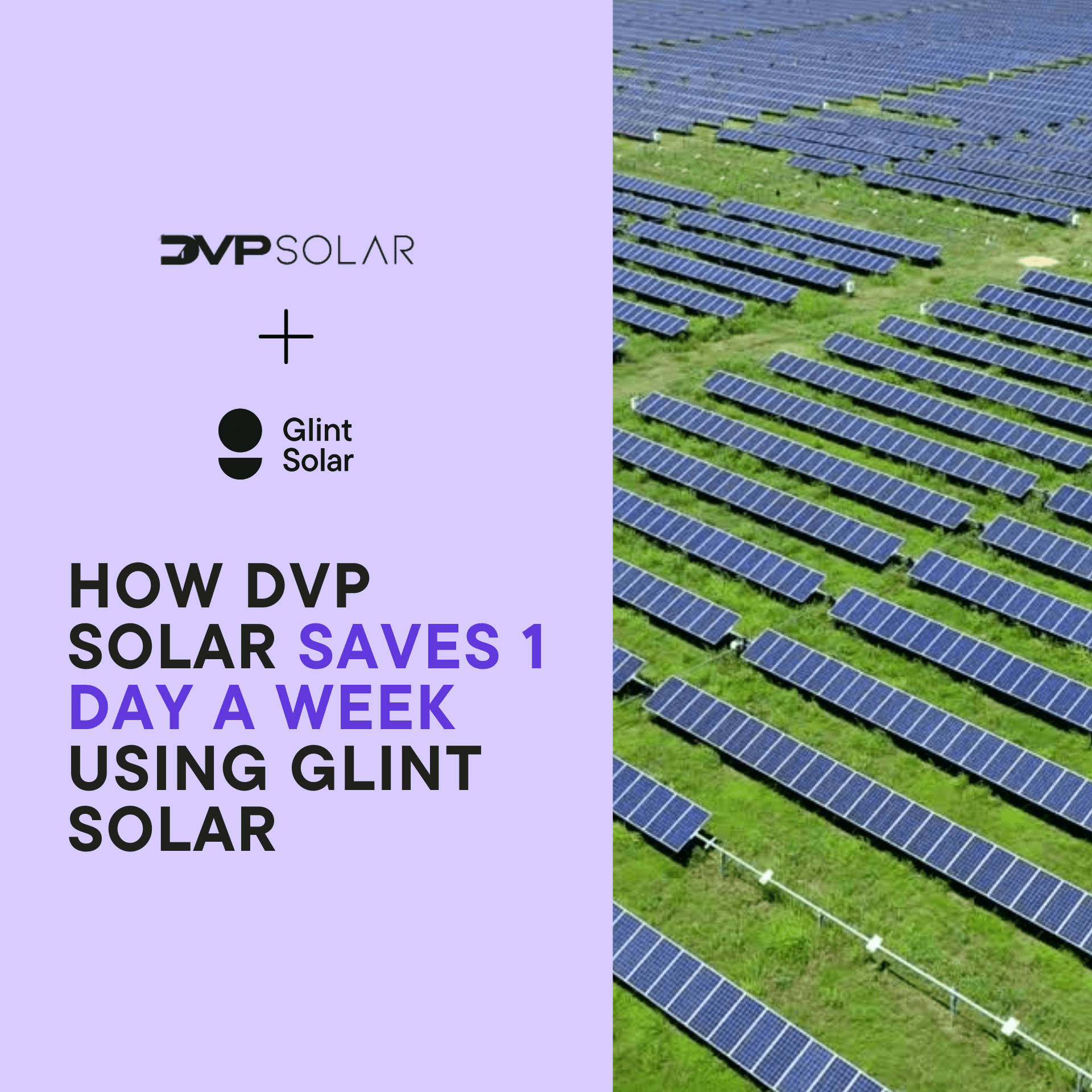
To see how Charts helped US-based utility-scale solar and battery developers Advantage Renewables, click here!

From spreadsheet tracking to pipeline decision support
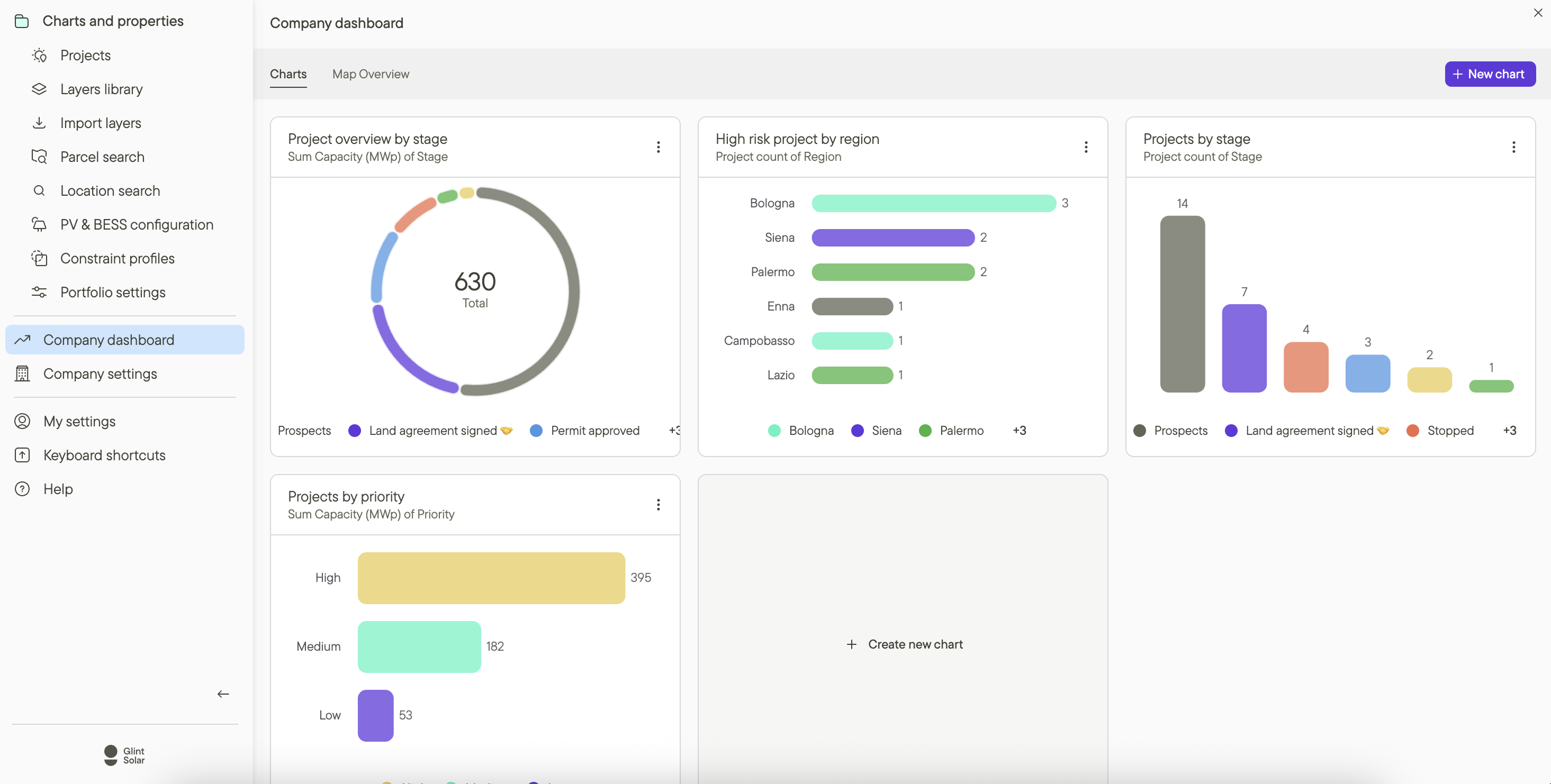
Charts turns your project data into a live, visual view of your pipeline helping teams manage execution like a portfolio, not a list.
Instead of rebuilding reporting every month (or trying to interpret a giant spreadsheet), teams can quickly understand what’s happening across regions, stages, and portfolios and act earlier.
With Charts, teams can:
Visualize pipeline status
In fast-moving markets, a pipeline snapshot that’s “accurate as of last month” is functionally useless. Charts gives teams a live view of progress across stages, regions, and categories, enabling continuous prioritization without rebuilding spreadsheets.
 Spot bottlenecks early
When grid and permitting timelines stretch into years, early intervention matters. Charts helps teams identify where projects accumulate, enabling quicker escalation, smarter reallocation of effort, and earlier deprioritization of risk-heavy sites.
 Balance workload across teams
Execution bottlenecks often happen because workload isn’t visible. Charts makes ownership and distribution clearer, allowing managers to identify overload and resource gaps before progress slows.
 Report with confidence
Leadership, boards, and finance teams increasingly need dependable reporting that reflects reality. Charts delivers consistent, up-to-date views across portfolios, removing uncertainty that comes from manual spreadsheets and inconsistent updates.
 Communicate progress clearly to stakeholders
Developers don’t just need pipeline visibility, they need to communicate it. Charts provides stakeholder-ready visuals that make pipeline maturity and progress easier to understand for leadership, partners, and investors.

Built for how development teams actually work
Charts reflects a simple belief: pipeline reporting shouldn’t sit outside the workflow.
It should be driven by the same structured project data teams use to run development every day so reporting stays accurate, ownership stays clear, and teams can spend less time chasing updates and more time moving projects forward.
Get Started with Charts Today
Charts is included with all Glint Solar plans that have Custom Properties enabled. If you're already using custom properties to structure your project data, you can start using Charts right now.