Webinar: Get Company Pipeline Visibility with Charts
Date: Wednesday 4th March, 2026
Time: 15:00-15.30 CEST | 09:00-09:30 ET
Most solar and storage teams manage their pipeline across Excel, GIS tools, emails, and static reports. That makes it hard to understand what’s actually moving, where projects are getting stuck, and how much real capacity sits in your portfolio.
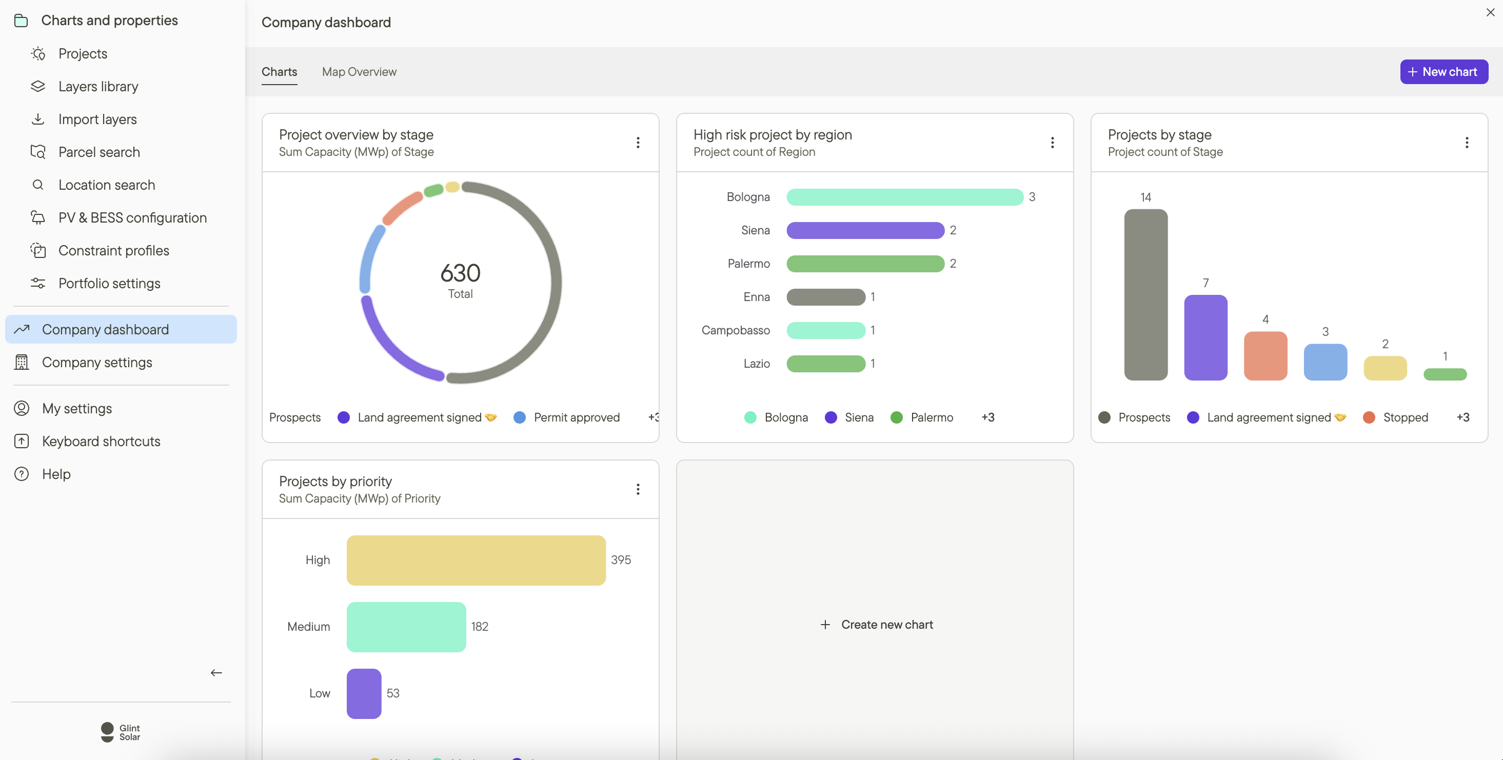
In this 30-minute session, we’ll break down the reality of modern development workflows and introduce Charts, Glint Solar’s new pipeline visibility feature, built to replace fragmented reporting with a visual overview of your projects.
What you'll learn:
-
The pipeline visibility problem: Why most teams lose clarity as portfolios grow — and how disconnected tools create delays, blind spots, and reporting overhead.
- Introducing Charts: How Charts turns project data into a real-time pipeline view — without exports or manual reporting.
- How teams use Charts in practice: Choosing the right views and how they work.
- Real-world examples: How development teams spot bottlenecks earlier, prioritize better, and communicate progress clearly across projects and regions.
By the end, you’ll understand how to:
-
Replace spreadsheet reporting with instant pipeline visibility
-
Spot delays sooner and focus effort on the strongest projects
-
Improve workload transparency across teams
-
Create clear visuals for leadership, partners, and investors